The papers I wanted to work with this time were the Rain Down on Me Volume 3 papers from Kiki Halbert. I think they are so pretty that I was just dying to work with them for a layout where I was the subject. (I think it is so important that we include ourselves in our scrapbooks.)
The problem for me is that I don't usually wear clothing that looks good with pastels. I'm a "bright colors" woman. In the photo I used for my layout, I was wearing a shirt that is three shades of green, including lime green. Not exactly perfect for those papers. But with a little bit of tinting, I can get the photo working with the papers.
To get started open your canvas in either Gimp or PSE. (If you use another program, you'll have to adjust the instructions to fit your program, but the basic concepts should work anyone whose program supports layers.)
Once the canvas is open, pull your background paper on to your canvas and then add your photo as a layer on top of the canvas.
Next, you need to duplicate your photo once. You can do this in both Gimp and PSE by going to Layer and choosing Duplicate Photo.
You now need to convert the duplicate photo to Black and White. To do this in PSE, go to Enhance and choose Convert to Black and White. You will then have to decide which Black & White style works best for your photo. In Gimp, you will go to the Colors menu and choose Desaturate. Once again, you will have to choose the option that works best with your photo.
Now that the photo has been converted to Black & White, create a duplicate of the Black and White photo as I described above.
It is now time to pick the color you want to use for the tint. I find that choosing a lighter color works best, but you'll need to experiment. In PSE, you will do this by clicking Select Foreground Color (it's the option at the bottom of the left side menu and PSE 7). You will then move your cursor over the background paper (select foreground color should remain open) and click on the color you want to use for tinting.
In Gimp, you will need to begin by highlighting the paper layer that will be your background for the layout. You will then need to choose the Color Picker from the Toolbar. (The Color Picker looks like an eye dropper and is right next to the magnifying class (zoom tool).) Now move your mouse over the background paper and click on the color you want to use.
Now it's time to create a new layer filled with the color you've just chosen. First, make sure your top B&W photo is the active layer. That way the new color layer will be right above that photo when it's created. In Gimp you will then go to the Layer menu choose New Layer, choose Foreground Color as fill type and then click Okay.
In Photoshop elements you will go to the Layer menu and choose New Layer. Once the layer is created (it will be transparent), choose the Bucket Fill option (on the left side menu it looks like a small paint bucket with the paint flowing out) and then click on your canvas. Your new layer will then fill with the desired color.
The next step in Photoshop Elements is easy peasy. Click Control + G and your color layer will not be the same size as your photo. You will now need to select a new Layer Mode. I find overlay works best for this purpose, but feel free to experiment until the photo doesn't look too dark and then right-click and choose Merge Down.
With Gimp, we have a little more work in front of us but not much. First, make sure your top photo is your active layer. Now right click on the photo and choose Alpha to Selection. You will then make the color fill layer your active layer and choose Copy and then Paste. You will then need to click the Create New Layer icon at the bottom of the layers toolbar. (It looks like a piece of paper and is on the left side immediately below the list of layers.) You will then need to drag your new layer immediately above the photo and then Delete the old color fill layer. Now it's time to choose a new Layer Mode and just as in Photoshop Elements, I recommend you use the Overlay mode. Now merge the layer down by right-clicking on the new color layer and choosing Merge down.
Now it's time to play with the opacity of the colorized photo and the B&W photo. In Photoshop Elements you do this by highlighting the photo layer you want to work with, clicking the down arrow next to Opacity and then sliding the slider that will appear. Normally, your B&W layer will be more opaque (say less than 50%) and your colorized photo will be more opaque (around 75%) but this is something you will definitely have to play with. Once you like the look of the photo, highlight all three layers, right-click and choose Merge Layers.
In Gimp, we are going to do much the same thing. Highlight the photo layer you want to work with and then slide the Opacity slider that is located right above the list of layers. My opacity recommendations are the same as I gave for Photoshop Elements. Once the photo looks right to you, you will right-click on the top photo layer and choose Merge Down. You will now have two photo layers and will once again do Merge Down for the top photo layer.
Congratulations!! You now have a tinted photo.
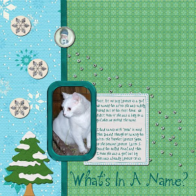
Here is how my layout turned out. I could have gotten by with not tinting the photo because of the green, but I think tinting it really allows is to work with the papers.
(full layout credits here)
If you have any questions, post them in the comments and I will be glad to answer them. And if you use my tutorial, I would love to see what you did with it.


